STBM Group·2026·Marketing & catalogue site
A catalogue that ends in a quote, not a checkout.
A twelve-page site for a contractor that builds slaughterhouses and wastewater plants across the UAE — designed and built end to end, with a catalogue of 123 machines that asks for a price instead of taking a payment.
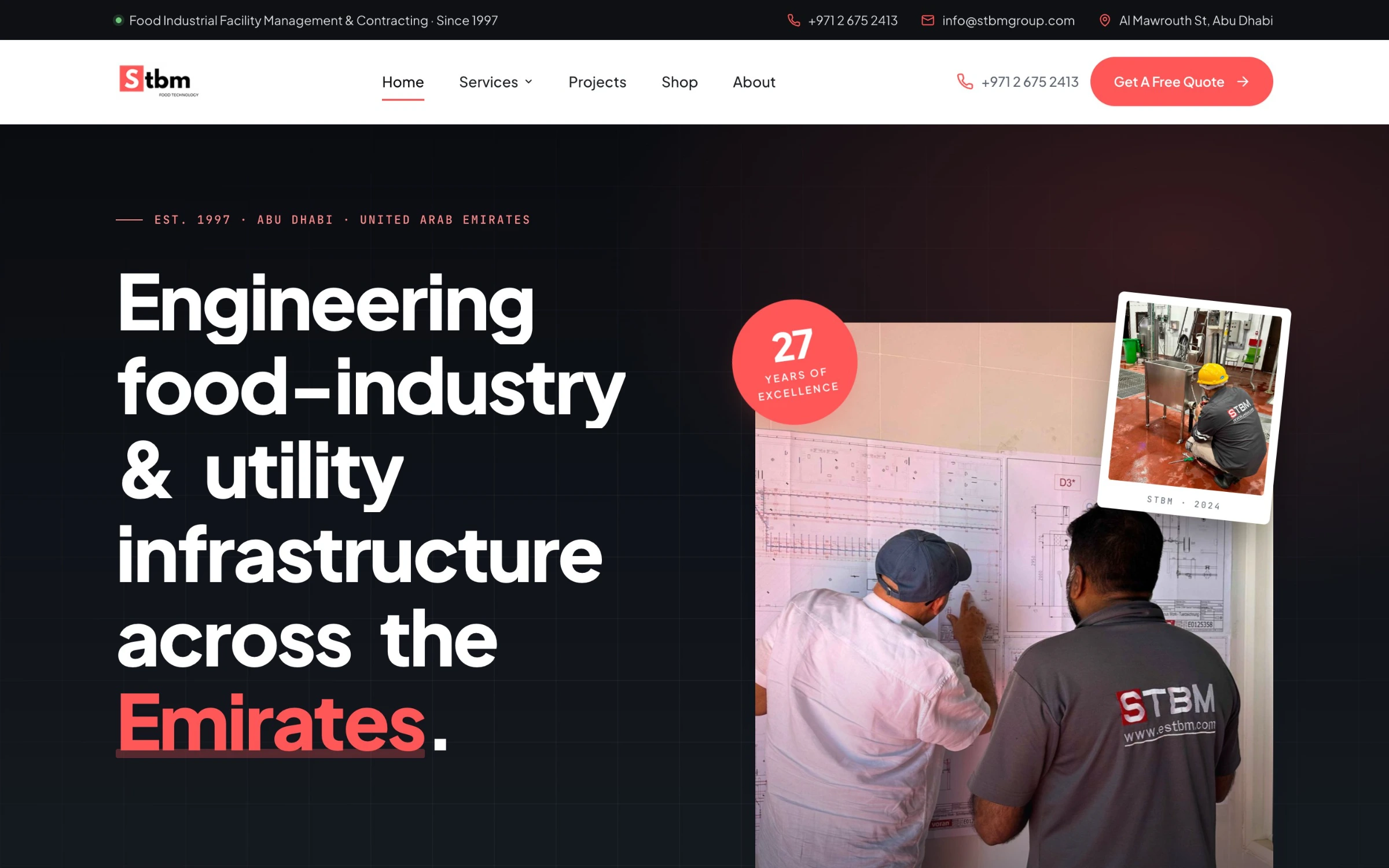
The story
STBM sells engineering projects worth millions and equipment quoted per enquiry, from a WordPress site carrying 57 stylesheets and 79 scripts on the homepage — and no heading on it at all. I designed and built the replacement end to end, in plain HTML, CSS and JavaScript.
- Role
- Design & development, solo
- Client
- STBM Group, Abu Dhabi
- Year
- 2026
- Discipline
- Marketing & catalogue site
- Scope
My contributions
57 → 1
Stylesheets on the homepage
79 → 0
External scripts
123 machines
Quoted, never sold
Chapter 01
Two jobs, one site
STBM builds and maintains slaughterhouses, wastewater plants and electromechanical systems for municipalities and food producers. The site had to convince a municipal engineer that the company can deliver a turnkey facility, and let a plant manager assemble a list of machines and ask what it costs. Those are different visitors wanting different things on the same afternoon, and the old site buried both behind plugin weight.
Chapter 02
A quote list, not a cart
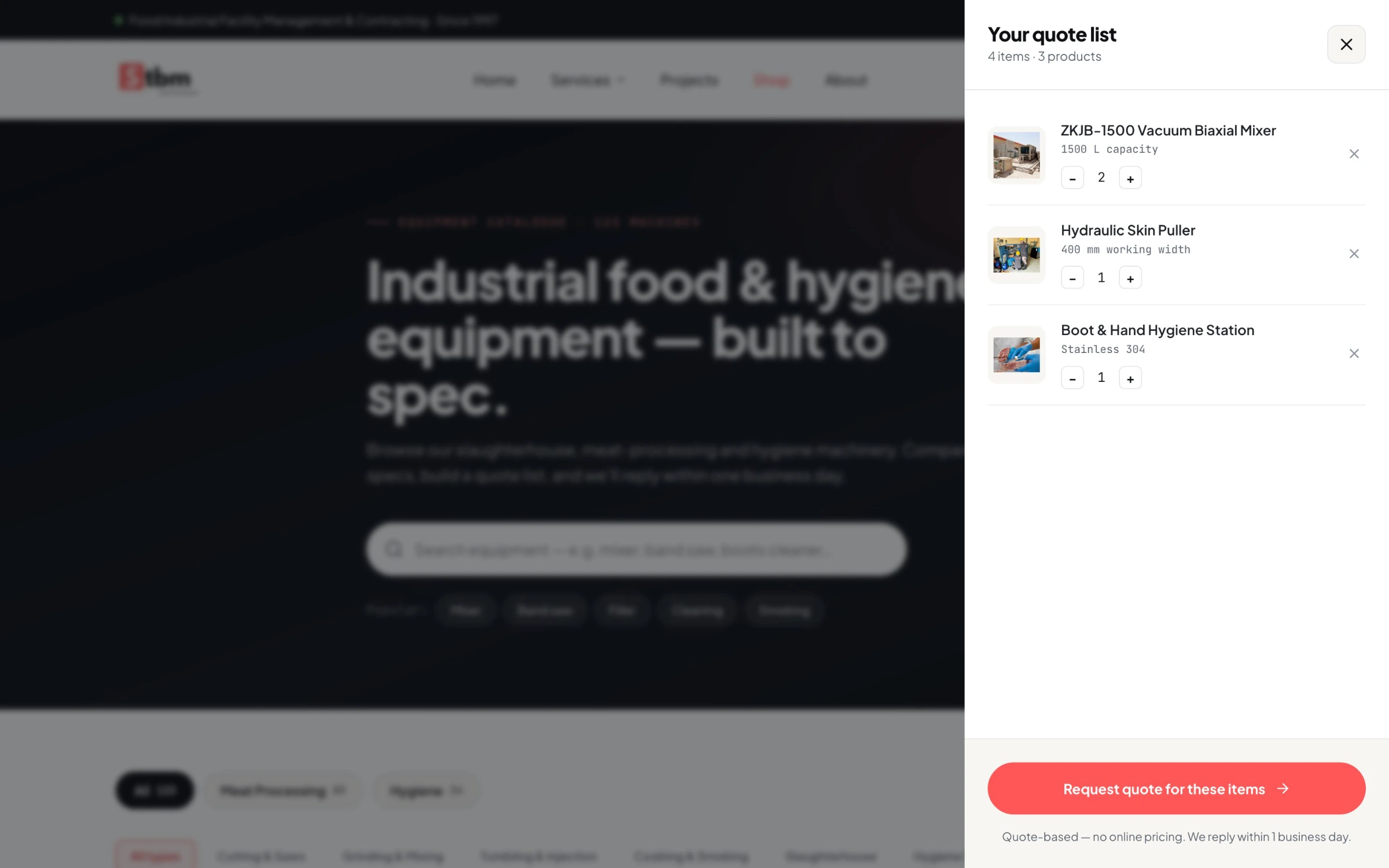
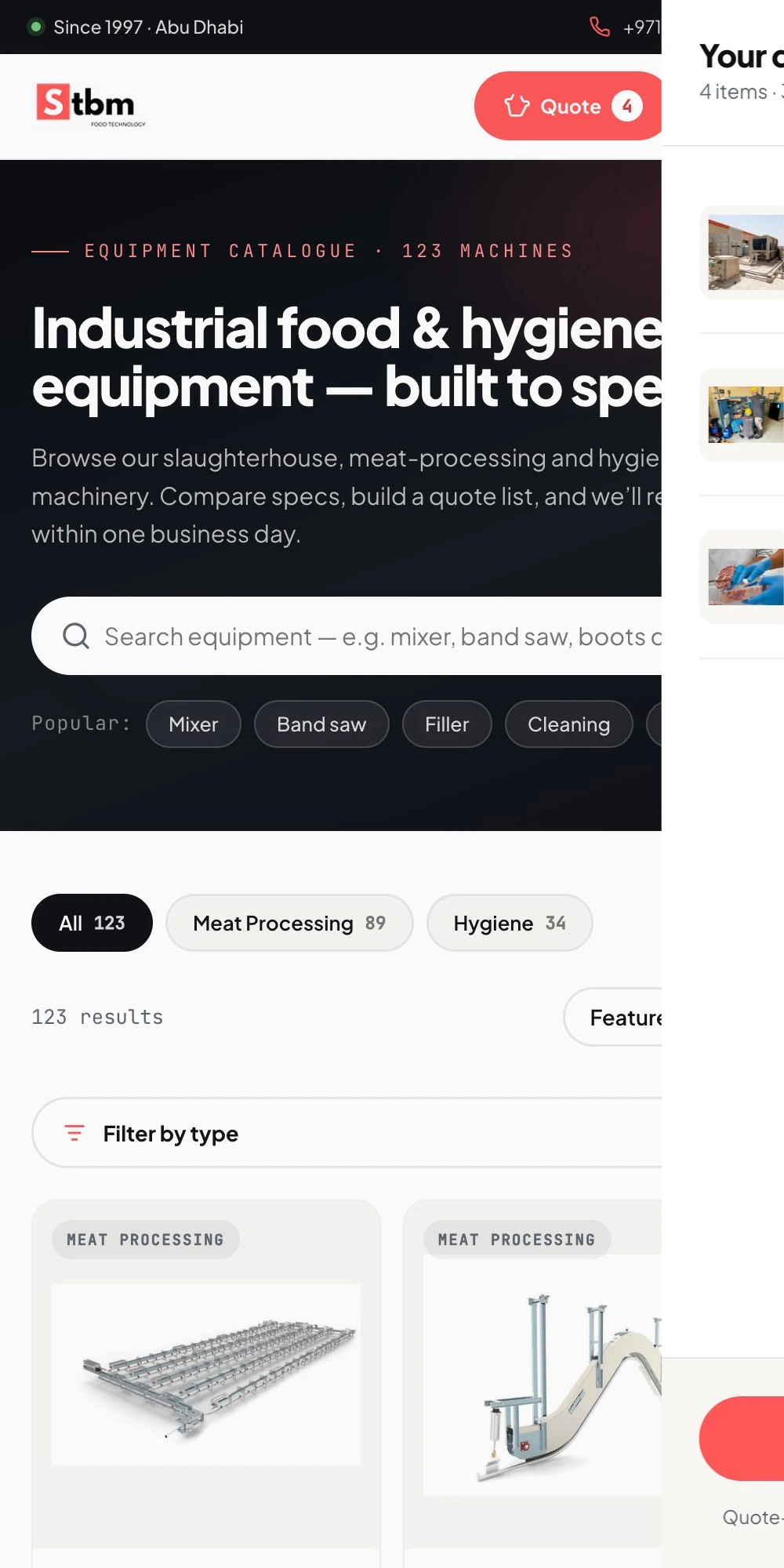
Nothing here has a price, because every machine is quoted per enquiry. So the catalogue does not end in a checkout — it builds a list. Add machines, set quantities, send it, and the enquiry arrives with the full specification attached. The list survives moving between the catalogue and the individual product pages, which is where a session normally loses everything a visitor has gathered.
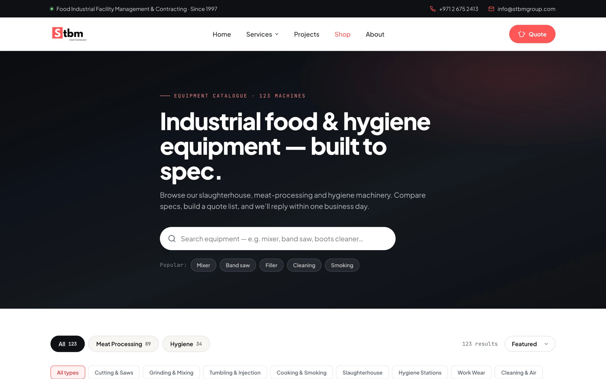
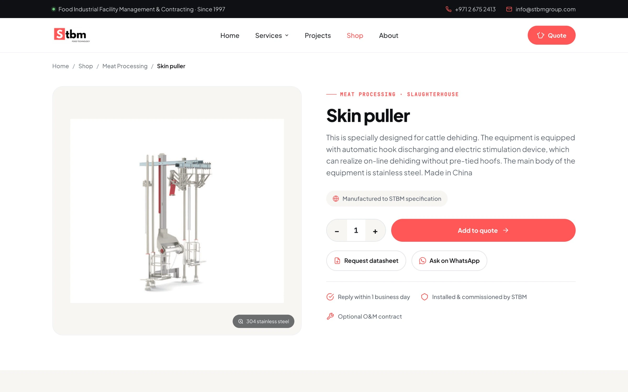
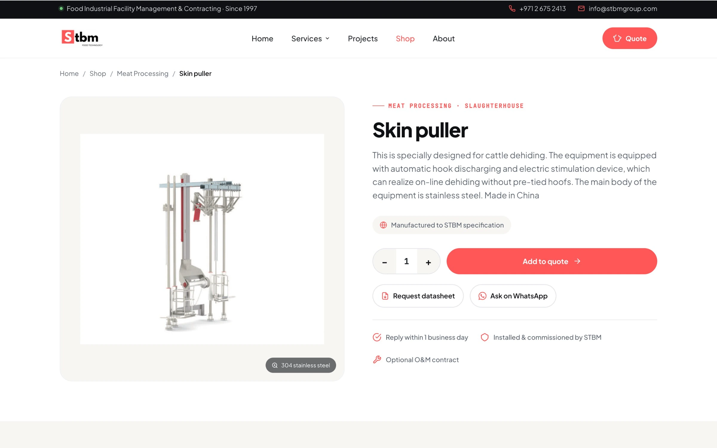
Chapter 03
A number before the phone call
Every prospect asks the same first question, and it is one most contractors answer only after a meeting. The services page carries an estimator: pick a discipline, set a facility size, and it returns an indicative range and routes the enquiry to the right team with the parameters already attached.
Chapter 04
Four templates, nineteen pages
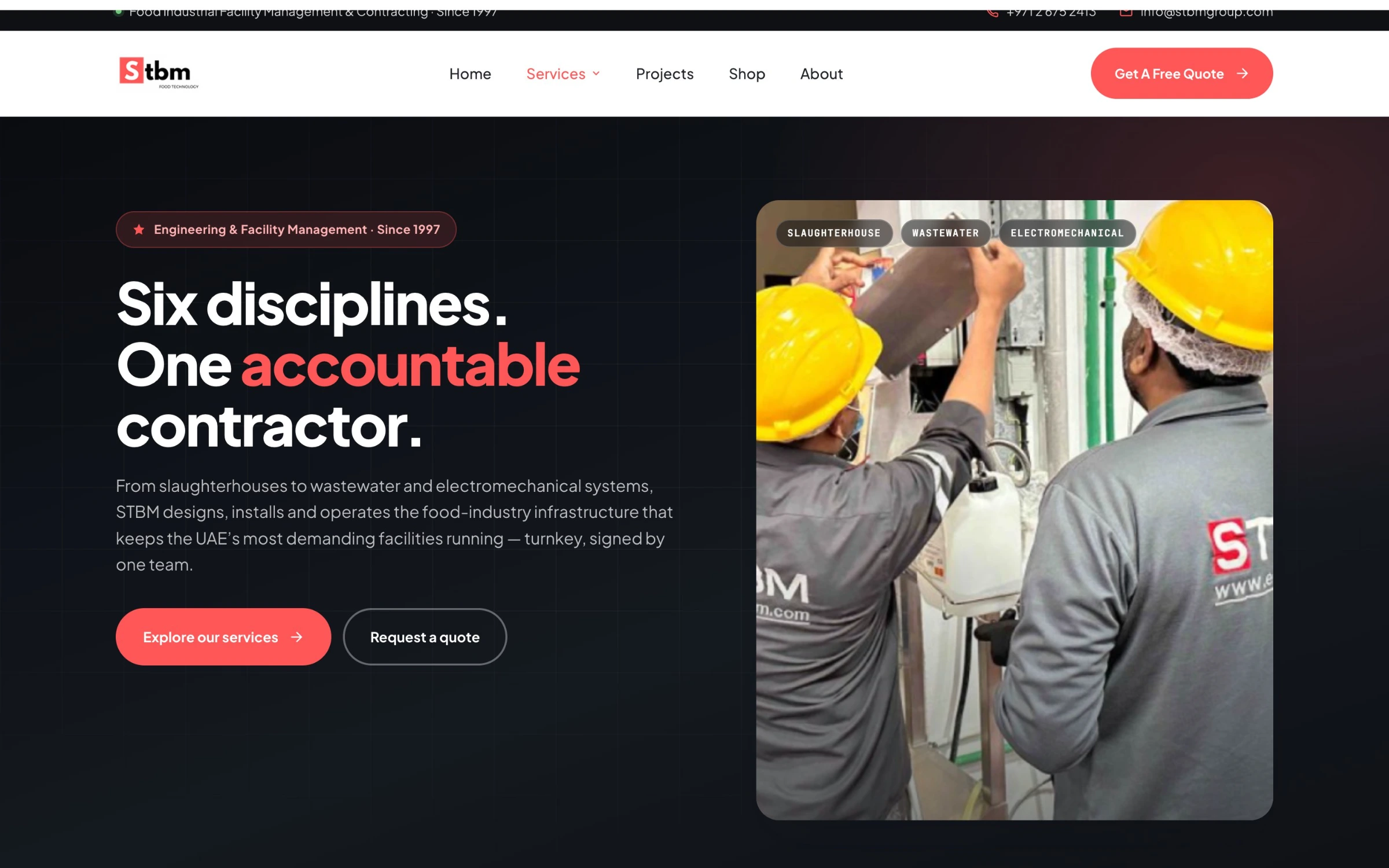
The facility types, the service disciplines and all 123 products are four templates reading from the URL, not nineteen hand-built pages. One layout to fix when something is wrong, and a new product is a row of data rather than a file.
- Facility template — cattle, sheep, poultry or deboning
- Service template — wastewater, flooring, air conditioning or hygiene
- Product template — all 123, by slug
- Catalogue template — every filtered view of the shop
Chapter 05
Measured, not eyeballed
Most of the engineering time went into how this behaves on a phone, and it was measured rather than looked at. I drove the pages in a real browser at 375 pixels and read the DOM, because a screenshot will not tell you that two pages disagree by four pixels.
The finding
The header was different on every page
Two of the twelve laid the quote button and the hamburger into the wrong grid column. The logo was 34px on the homepage and 44px everywhere else. Four different button shapes.
The fix
One canonical header
All twelve now measure identical: navigation row 66px, button at x 206→308, hamburger 315→359.
The finding
Chips and figures broke raggedly
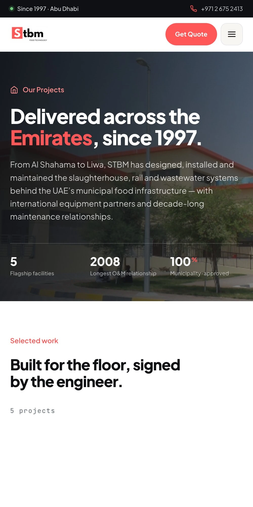
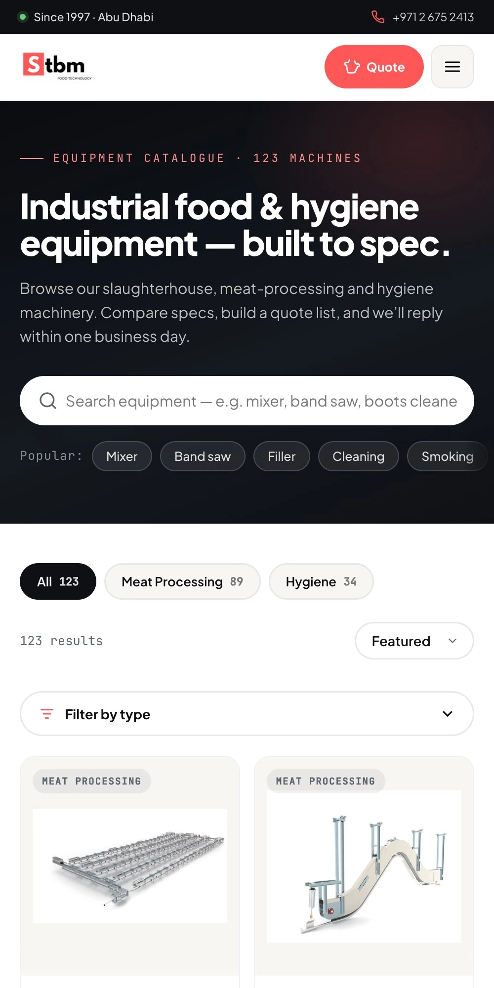
Filter chips wrapped into three uneven rows; three hero statistics wrapped to two and left an orphan on its own line.
The fix
Strips and equal columns
Chips became one swipeable strip that bleeds to the edge and fades to signal more. Statistics became three equal columns. Zero pixels of horizontal overflow at 375px, on all twelve pages.
Chapter 06
Before and after
Measured on both live sites, same network, same moment. The byte figures are the HTML document itself, not full page load.
- HTML document — 301,595 bytes, now 173,303
- Delivery time — 1.54 s, now 0.55 s
- Stylesheets — 57, now one, inline
- External scripts — 79 tags, now none
- A heading on the homepage — none, now one

Chapter 07
The honest half of that table
Part of the speed difference is hosting, not code: the new site sits on a CDN and the old one is on shared hosting. The stylesheet and script counts are the fairer comparison, and those are a straight consequence of building without a plugin stack. Worth saying out loud, because a before-and-after table is the easiest place on a portfolio to take credit for someone else's infrastructure.
Chapter 08
Forms that work without a backend
A static site cannot send email, so all 21 forms route through one setting. Without a key they open the visitor's own mail client pre-filled and say so, rather than showing a success message that means nothing. With a key they post directly. A failed send keeps everything typed and shows the phone number. Wiring this is how I found that five of the seven quote forms had no name attribute on any field. They were invisible to every send method, and would have swallowed enquiries in silence.
Chapter 09
Details that are easy to skip
The parts nobody asks for and everybody notices when they are missing.
Assets
Nothing hotlinked
All 208 images pulled local and rewritten to relative paths, checked for exact filename case so it survives a Linux host. Every photograph is a facility STBM actually built.
Icons
Rebuilt, not upscaled
The logo's mark is 41 pixels wide — far too small for a 512px app icon. I redrew it in the site's own display face: square for the browser tab, rounded for a home screen.
Sharing
Links that preview
No page had a share image, so every link rendered as a blank card. Now a real photograph of the delivered hall, with the camera's burned-in timestamp cropped out.
Motion
Reveals that can be turned off
Scroll-triggered reveals, a cursor-following glow on dark sections, and a testimonial carousel that pauses when the tab loses focus. All of it respects reduced motion.
Chapter 10
What I would do differently
Three things I would change, written down rather than quietly left out.
- The catalogue is a snapshot, exported once — new products added in WordPress will not appear
- The gallery serves full-resolution photographs; they should be resized before this is production
- White on the brand coral measures 3.11:1 — fine for large text, not for body copy
Reflection
What I learned
A shop is not always a shop
The instinct with 123 products is to reach for a cart. But nothing here has a price, and a checkout would have promised something the business does not do. The interesting design work was in what replaces it — a list that survives the visit and leaves with a specification attached.
Measuring beats looking
A header that is wrong on two of twelve pages looks fine in every screenshot. Reading the DOM at 375 pixels found four button shapes and a logo that changed size between pages — none of which I would have caught by eye, and all of which a visitor feels without being able to name.
The bugs were in what nobody tests
Five of seven quote forms had no name attributes. They rendered perfectly and submitted nothing. Nobody catches that by clicking around, because the form appears to work — which is exactly why it is worth going through the parts that only fail silently.
Say which half of the win is yours
The new site loads three times faster, and part of that is a CDN rather than anything I wrote. Writing that down costs a good number and buys the only thing that matters when someone is deciding whether to trust the rest of the page.